If you are one of the people who can no longer use Ravelry to search for knitting patterns, you can search on any major search engine and remove the results for Ravelry.
On Google, type in your search and add “-ravelry” and “-pinterest” (without the quotation marks). If you don’t mind going through pins you can leave that off.
On most other major search engines just add “-ravelry” at the end.
I will be adding two more planned articles, (one article and one tutorial), on website accessibility in the near future and will then get back to adding new freebies and sharing some fun projects and tutorials from crafts people I admire.
Cassidy Forbes from Ravelry is now sending out emails to people saying there is no problem with the new ravelry design, that it does not cause migraines and seizures and that people should “consider the sources” of such information. So far three people have come forward saying they recieved this email, or one like it that stated the same things.
For the record, I am one of the people for whom Ravelry caused a seizure in the new design, and migraines a couple of days after switching to Classic mode when they started changing fonts.
I am not a liar.
I am not having a “hysterical response”.
I have never had this extreme or as fast a response from any other website.
I am not spreading lies.
Ravelry are not inclusive.
Ravelry is now sending out a form letter. Saying there are no problems with the updated design. Everyone who has problems is lying. The disability community is lying, according to ravelry. Share this. Tell everyone what ravelry is doing. #ravelryaccessibility#ravelrypic.twitter.com/CmlwPatHeF
IMPORTANT NOTE: Payhip have been so good at responding to requests to make shops more accessible that this tutorial is no longer relevant. Whilst there are still some problems, they are actively working on fixing them.
Once again, I am supplying code that you can copy and paste so that it’s useful for the largest number of people possible. If you know CSS, I’ll try and explain what each change is doing in regards to accessibility so you can edit it to your own tastes.
These changes should all be pasted into the “customise css” box for the store page.
The Rainbow Stripe
The rainbow stripe at the top of the page is very distracting, which can cause issues for people who are visually sensitive. Let’s get rid of it.
div.stripe
{
display: none;
}
The Share Button
The share button on Payhip stores is a huge problem when it comes to accessibility because it has no indication of what it is for unless you’re familiar with the share icon on mobile devices. I am familiar with the share icon on mobile but I still didn’t understand what it was until I clicked on it. (In fact, I only realised that’s what it was today).
We can’t edit the html to give it a name, but we can make sure the text is readable and it’s purpose is obvious. (Huge thanks to Twitter user superastrofemme, who helped me with the font change!)
/* Change Share Button to Say "Share" */
a.btn.btn-default.dripicons-upload.display-share-seller-profile-button::before
{
font-family: proxima-nova,Arial,Helvetica,sans-serif !important;
content: "Share";
color: #555;
}
Even though this button now has a visible word on it, screen readers can still not tell what it is. Unfortunately there’s nothing we can do about this, but I will be following up with Payhip to see if they can fix it.
The Social Media Account Icons
By default, the social media account icons are very small, pale circles. When you click on these, they go to the Payhip shop owner’s social media accounts. On desktop they’re way up in the top, right hand corner of the page, whilst on mobile, they sit under the shop name.
Let’s make them larger, and put a little extra space between them. This makes them easier to see, and easier to use on mobile. I’m increasing the size by 150% and making them slightly more opaque. They’ll be easier to see, but not black, which would grab the visitor’s focus away from the main content of the page.
/* Increase size and opacity of social sharing icons */
.ap-top-author-details .on-the-web-wrapper img
{
width: 30px;
height: 30px;
margin-right: 15px;
opacity: .5;
}
The social media account icons will now be slightly larger and darker like those in the image below. The number of icons on your page will depend on how many of your social media accounts you have linked to Payhip.
The Active Collection Button
When you use collections in Payhip, the button for the collection you are currently looking at is called the “active collection button’. The background was just a little too light in contrast to the white text. This code will make it match the blue of the price and other elements on the page.
/* Darken backround on the active collection button */

.ap-collections-wrapper a.active, .ap-collections-wrapper a.active:hover {
border-color: #0a5f91;
background-color: #0a5f91;
}
Here’s how the active collection button will look after the changes. The background is a little darker than previously.
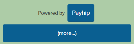
The “More” Down Arrow
Using a link to make footer navigation show up is not a best practice. The best thing to do would be to make the links visible at all times, or at least give the arrow link a name, but we can’t do that. Since we can’t, let’s change the text of the link to make it more obvious what clicking on it will do.
/* Change down arrow to text and make some room between links*/
.profile-page-footer a
{
margin-right: 20px;
}

.profile-page-footer a#footer-show-more-link
{
position: relative;
top: -1px;
}

.profile-page-footer a#footer-show-more-link:before
{
font-family: proxima-nova,Arial,Helvetica,sans-serif !important;
font-size:0.9em;
content: "(more…)";
}
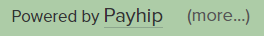
The arrow has now been changed to say “(more…)”. Note that my background is green. Yours will either be the default grey, or the colour you chose to use.
As with the share button, this link still can’t be seen by text readers and I’ll be following up with Payhip about this, and other issues to see what they can do to fix them.
Changing the Footer Links for Mobile
When you have links that are close to each other, you need to have plenty of space around them on mobile websites because fingers are bigger than cursors. The following code will make all of the links in the footer look like buttons if you’re viewing the page on a device fewer than 600 pixels wide.
@media only screen and (max-width: 600px)
{
/* Change footer link styling for mobile */
.profile-page-footer a, #footer-more-section a
{
text-decoration:none;
color:#fff;
background-color: #0a5f91;
display:inline-block;
border-radius: 5px;
padding:15px;
margin:5px;
}
.profile-page-footer a#footer-show-more-link
{
display: block;
max-width:100%;
}

.profile-page-footer a#footer-show-more-link:before
{
color:#fff;
}
.profile-page-footer a, #footer-more-section a:selected
{
color: #0a5f91;
background-color: #D3D3D3;
}
}
Here’s how the footer links will look on mobile. Again, your background colour will be different to mine.
The Product Pages
These changes should all be pasted into the “customise css” box for the product pages.
The Rainbow Stripe
We’re going to get rid of the rainbow stripe on the products page in the same way we did on the store page.
div.stripe
{
display: none;
}
Text and Slideshow Button Contrast
When you have uploaded more than one image for a product, there will be arrows in pale grey boxes on either side of your images. The background of these, and the colour of text in the page need to be slightly darker.
/* Change the colour of the slideshow arrows */
button.slick-arrow
{
background-color: #aaa;
}
button.slick-arrow:hover
{
background-color: #666;
}
/* Change the colour of text */
.view-page-wrapper .by-seller-section, .meat-skirt .description, .view-page-wrapper .view-page-meta .meta-file-size, span.dripicons-duplicate
{
color: #666;
}
The “More” Down Arrow
Just as we did for the store page, we need to change the text of the down arrow in the footer to make it’s purpose clearer.
/* Change down arrow to text and make some room between links*/
.view-page-footer a
{
margin-right: 20px;
}
.view-page-wrapper .view-page-footer a#footer-show-more-link
{
position: relative;
top: -1px;
}
.view-page-footer a#footer-show-more-link:before
{
color: #555;
font-family: proxima-nova,Arial,Helvetica,sans-serif !important;
font-size: 0.9em;
content: "(more…)";
}
Changing the Footer Links for Mobile
The following code will change the links in the footer on mobile to match those on the store page
@media only screen and (max-width: 600px)
{
/* Change footer link styling for mobile */
.view-page-wrapper .view-page-footer a, #footer-more-section a
{
text-decoration:none;
color:#fff;
background-color: #0a5f91;
display:inline-block;
border-radius: 5px;
padding:15px;
margin:5px;
}
.view-page-footer a#footer-show-more-link
{
display: block;
max-width:100%;
}
.view-page-footer a#footer-show-more-link:before
{
color:#fff;
}
.view-page-footer a, #footer-more-section a:selected
{
color: #0a5f91;
background-color: #D3D3D3;
}
}
The Checkout Page
Changing the Footer Links for Mobile
One last change is to make the footer links on the checkout page match the rest of the site.
@media only screen and (max-width: 600px)
{
/* Change footer link styling for mobile */
.checkout-footer .checkout-footer-left
{
background-color: #f4f4f4;
padding: 15px;
}
.checkout-footer .checkout-footer-right a
{
text-decoration:none;
color:#fff;
background-color: #0a5f91;
display:inline-block;
border-radius: 5px;
padding:15px;
margin:5px;
}
.checkout-footer .checkout-footer-right a :selected
{
color: #0a5f91;
background-color: #D3D3D3;
}
}
How Has Making these Changes Improved Accessibility?
If you were to check your Payhip shop’s accessibility using Lighthouse in Chrome’s dev tools, you’ll find the score has been improved by about 5 points. That’s not a great difference, and honestly, it’s not a good score (57 on desktop and 75 on mobile). The changes that still need to be made are simply beyond our control as Payhip shop owners.
What we have done, however, is supply some workarounds for the problems that remain, and improved a lot of the accessibility features that cannot be measured by software.
Even though your photos don’t have any alt tags, the names of your patterns are immediately available on the main shop page, and descriptions of the photos are available in the text block on your product pages.
People who navigate by tabbing through your page on a keyboard can navigate through the whole page without getting stuck.
Whenever a link or button is being selected, or a mouse is hovering over them, there’s an obvious change in the way they look.
It’s obvious what all the links and buttons are for if you are sighted, and with some assistance technology. I’ll be following up with Payhip to see if they can make the share and “more” footer links readable to screen readers.
It’s possible to navigate the page and purchase a pattern using the NVDA screen reader, aside from the previously mentioned links. (NVDA is an open source, free screen reader used by approximately one third of screen reader users. You can download it to test if it works with your website, and what happens if you don’t have alt text on images).
All elements can be seen by people who are colour blind.
All fonts are of a reasonable contrast and size, and zooming in to the page will make them larger.
Pages are fully viewable, even when zoomed in to 300%
There are no videos or animated elements that will play without the visitor’s consent and prior knowledge.
I will be following up with Payhip over time to see if they can fix some accessibility aspects of stores when their budget allows for coding changes. In the meantime, hopefully the changes in my tutorials are helpful.
IMPORTANT NOTE: Payhip have been so good at responding to requests to make shops more accessible that this tutorial is no longer relevant. Whilst there are still some problems, they are actively working on fixing them.
Over the past few weeks a lot of knitting and crochet designers have been adding their patterns for sale via Payhip, however their shop accessibility for purchasers is not very good. They have given us the ability to change options and add our own css to customise our shops, so I’m sharing a few fixes and workarounds that I have applied on my Payhip shop to make it as accessible as possible.
You won’t need to know any programming or css to implement these fixes. To make this tutorial useful to as many shop owers as possible, I’m going to give you the code and a photo tutorial on where to place it.
Please note that I am NOT a graphic designer so my shop has the same retro look as my website. The CSS and fixes I’m giving you below will not turn your Payhip shop into a clone of mine! They will, however, increase the accessibility of your shop for your customers. It doesn’t fix all the accessibility problems as we have limited editing capabilities, but does make a lot of things better.
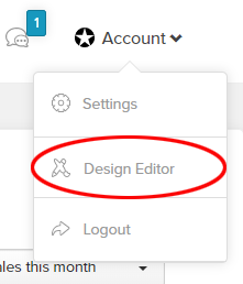
Where Do I Customise my Payhip Shop?
Sign in to your Pahyhip account and you will be taken to your dashboard. On the top, right hand side of your screen you’ll see a star icon and the word “Account”. Click on that and a drop down menu will appear.
Click on “Design Editor”
This will take you to the editing section.
Customising Your Shop
The Store Page
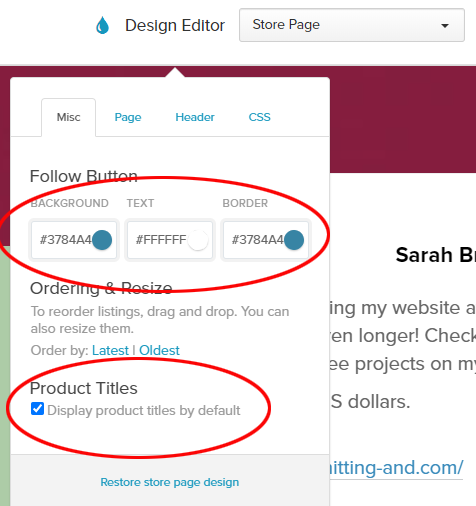
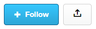
Firstly we need to increase the contrast on the follow button.
On the left hand side of your screen you’ll see the words “Design Editor”. Click on “Product Page” from the drop down menu on the right and choose “Store Page”.
You’ll want to change two things. Firstly, the colour code for the follow button. I made it a slightly darker shade of the original colour by changing the hex code in the background box to #3784A4. You can also change the hex code for the border if you want to.
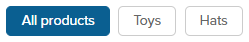
Next we need to display the titles of all of our products. At the bottom of the menu click the check box next to “Display product titles by default”. This means that users won’t have to hover their mouse over the product images to see what they’re called.
Finally for the store page, we’re going to add some custom css to fix a few issues.
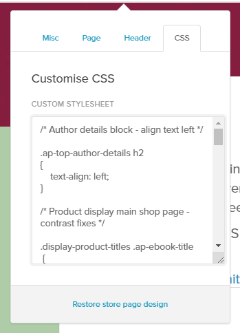
Click on “CSS” at the top of the editing menu. You will see a re-sizable text box in which you can paste your custom CSS code.
First of all, we’ll darken the colour of the backgrounds for the product titles and the little flags that show the price.
Copy and paste the following the following code into this box.
/* Changes the background colour on product titles and the price flags to increase readability */

.display-product-titles .ap-ebook-title
{
background: #0a5f91;
padding-top: 2px;
padding-bottom: 2px;
}
.ap-ebook-price {
background-color: #0a5f91;
}
/* Triangle before price */
.ap-ebook-price:before {
border-right-color: #0a5f91;
}
Next we’ll turn off the animated effect when hovering the mouse over a product and replace it with an outline. We’ll also make the outline around the product when a person navigating our shop using a keyboard has landed on the product. This is called “focus”. We want keyboard users to know when they have focus on links so they know what they’re “clicking” on when they hit the enter key.
/* Turns off the animation when hovering the mouse over a product */

.display-product-titles .ap-ebook:hover
{
transform: none;
}

/* Makes an outline around products when a keyboard tabs to the product so people using a keyboard to navigate know where they are on the page */

.display-product-titles a.ap-ebook:focus, .display-product-titles .ap-ebook:hover
{
outline: 5px solid #0a5f91;
outline-offset: -5px;
}
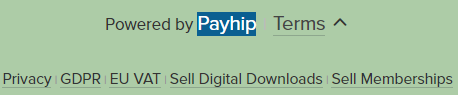
The final piece of code makes the links in the footer more visible, and makes it more obvious when someone is hovering their mouse over a link. The word “Payhip” in the image below shows the way the links look when a mouse is hovering over them. Note: the background colour of my shop is a greyed light green, however yours will be grey if you have left it at the default colour.
/* Footer contrast and font size fixes. Bigger fonts with more contrast. */

.profile-page-footer
{
font-size: 1.2em;
color: #333;
}
.profile-page-footer a
{
font-size: 1.2em;
color: #333;
}
footer-more-section a
{
font-size: 1.3em;
color: #333
}
.profile-page-footer a#footer-show-more-link
{
color: #555;
}

/* Footer hover fixes. Makes it more obvious when a mouse is hovering over on of the links at the bottom. */

.profile-page-footer a:hover, .profile-page-footer a#footer-show-more-link:hover, #footer-more-section a:hover
{
color: #fff;
background: #0a5f91;
}
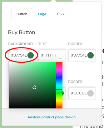
The Product Page
In the design editor menu, choose “Product Page”. The first thing we’ll change is to darken the background colour of the button. I changed mine to a darker version of the default colour by using the hex code #37754E
If you want to change it to a different colour, choose something from around the middle of the popup colour chooser. You can change the colour by sliding the rainbow coloured slider around. Don’t choose a light colour like cyan or yellow though. The best colour to choose is cool, such as blue or green, slightly darker than the mid range of the colour chooser, and slightly greyed. If you would like to, change the border colour as well.
Now we’ll fix the text size, contrast and hover on the footer links in the css panel as we did for the shop page. This code will also darken the currency sign. In the css panel paste the following text.
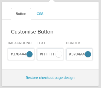
In the design editor menu, choose “Checkout Page”.
Under “Customise Button”, make the background and border colours the same as you did on your “Follow” button on the store page. I chose to make a slightly darker shade of the default colour, #3784a4
Now we’ll fix the text size, contrast and hover on the footer links in the css panel as we did for the shop and product pages. This will make all of the pale grey text larger and more visible.
In the css panel paste the following text.
/* Fix the contrast of pale grey text */

label, p.input-label, div.cart-reminder-wrapper, .price-large-wrapper .currency
{
color: #333;
}
/* Darken and make larger - Secure payment with account or card via PayPal, footers and text */

.home-section .security-message-paypal-only-wrapper .security-message-text, .checkout-footer .powered-by-badge, .checkout-footer .checkout-footer-right a
{
font-size: 1em;
color: #000;
}
.checkout-footer .checkout-footer-right
{
padding-top:3px;
padding-bottom:3px;
background-color: #f4f4f4;
}
Other Things to Consider
The Product Page
If your product has more than one image, make sure thay are all the same height so the text on the page doesn’t move up and down the screen when your visitors click through the image carousel.
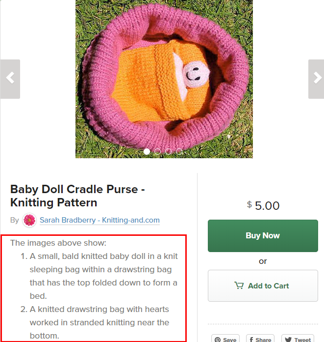
Since we have no way of adding alt text to our product photos in the carousel, adding descriptions of the photos in the product descriptions will at least tell visitors what they are if they can’t see the pictures for whatever reason.
These were all the accessibility fixes I managed to make to my shop, some remain that I was not able to fix.
If you found this tutorial useful please share it, or if you have any tips on making more changes to Payhip shops please leave a comment below.
Additional Code Added July 13th 2020
The Store Page
As I’ve learnt more about the CSS on Payhip, I’ve been able to make more accessibility changes. Adding the following code to the CSS of the Store Page will:
Change the look of the “Follow”, Share, and Collections buttons when users hover their cursor over them.
Increase the size of the font on the Collections buttons.
/* Make hover on follow button evident by changing the background to grey and the text blue*/

body > div.ap-wrapper > div.ap-top-author-details > div.ap-author-details-button-wrapper > div.default-state > a.btn.btn-primary.btn-blue.initial-follow-button:hover
{
color: #0a5f91;
background-color: #D3D3D3;
background-image: none;
}

/* Increase the size of the text on the collections buttons and make them change colour on hover. Background changes to blue and the text changes to white */

.ap-collections-wrapper a
{
font-size: 1em;
}
.ap-collections-wrapper a:hover
{
color: #fff;
background: #0a5f91;
}

/* Make the share button change colour on hover. Background changes to blue and the text changes to white */

body > div.ap-wrapper > div.ap-top-author-details > div.ap-author-details-button-wrapper > div.default-state > a.btn.btn-default.dripicons-upload.display-share-seller-profile-button:hover
{
background: #0a5f91;
}

body > div.ap-wrapper > div.ap-top-author-details > div.ap-author-details-button-wrapper > div.default-state > a.btn.btn-default.dripicons-upload.display-share-seller-profile-button:hover::before
{
color:#fff;
}
I am trying to find out if I can also change the font of the share button so I can make it say “Share” instead of using an icon. If I can, I’ll update with more information here.
The Product Pages
Adding the following code to the CSS of the Product Page will change the colours of the “Buy Now” and “Add to Cart” buttons when users hover their cursors over them. It will also increase the size of the text on the “Add to Cart” button.
/* Change the colours of the Buy Now button when hovered. The background changes to grey, and they text to green */

.view-page-wrapper .meat-skirt-right a.buy-button:hover
{
background-color: #d3d3d3;
color: #37754E;
background-image:none;
}

/* Change the colours of the Add to Cart button when hovered and increase text size. The background will change to blue and the text will change to white */

.btn.btn-default.btn-default-line-green:hover
{
background-color: #0a5f91;
background-image:none;
}
.view-page-wrapper .meat-skirt-right a#add_to_cart:hover {
color: #fff;
}
.add-to-cart-buy-page #add_to_cart
{
font-size: 1.2em;
}
As I can no longer sell my knitting patterns on Ravelry due to not being able to view the site, I’ve chosen to make them available on Payhip, so they remain available for anyone that would like to purchase them.
If you bought any of my patterns on Ravelry, you should still have them available in your library to download any time you want them. However, if you would like to ask any questions about the instructions, you’ll need to contact me here and I’ll be happy to help.


